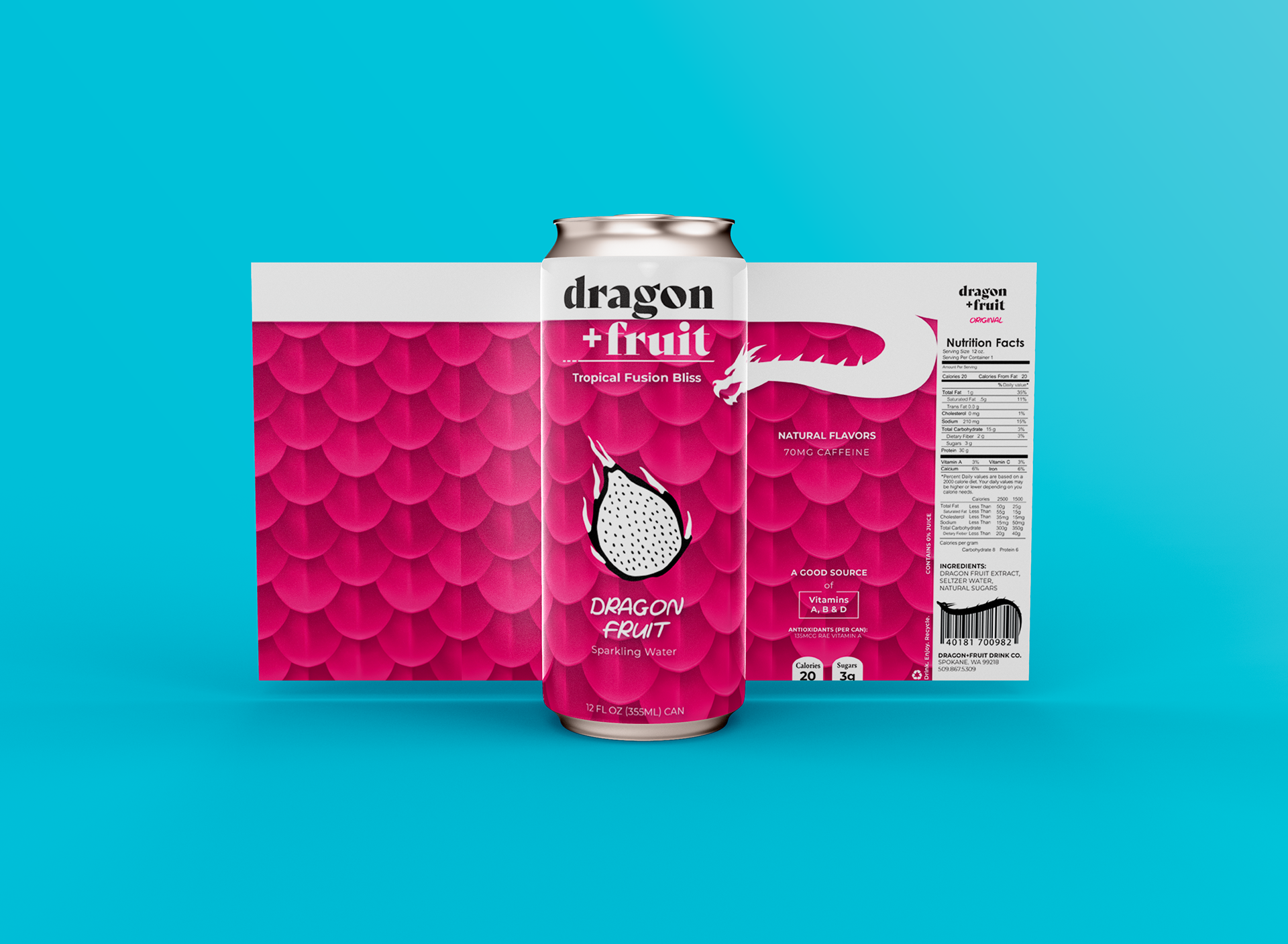
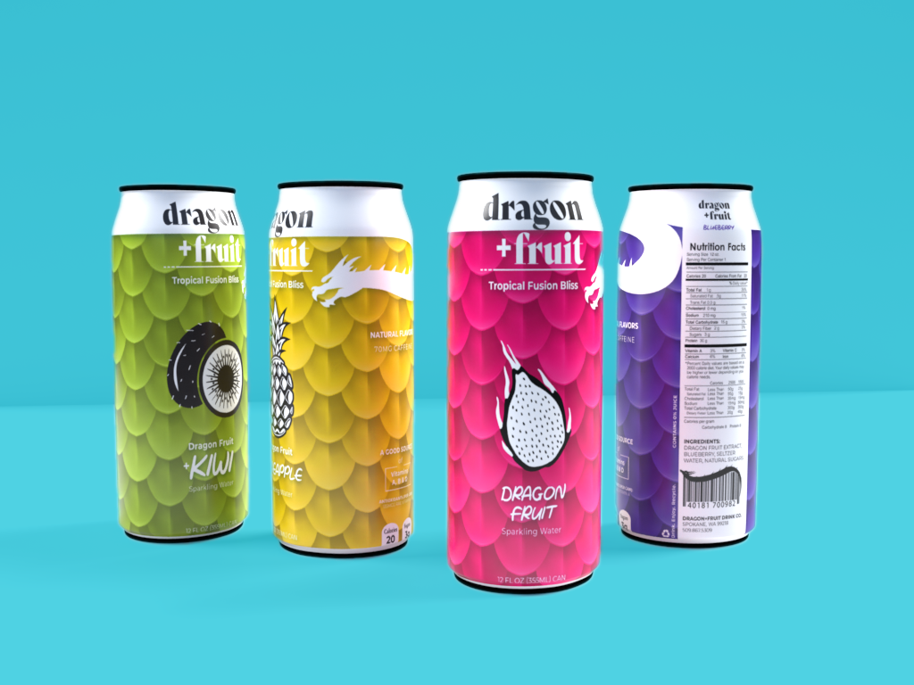
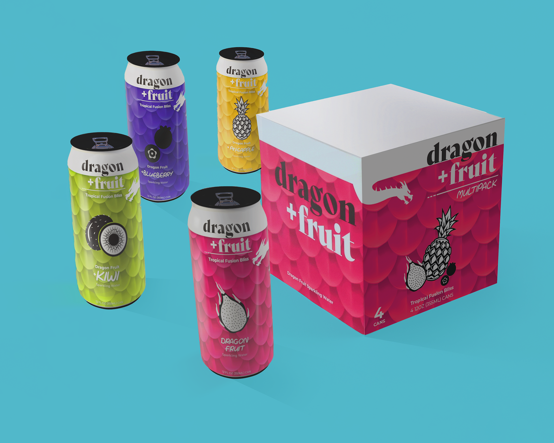
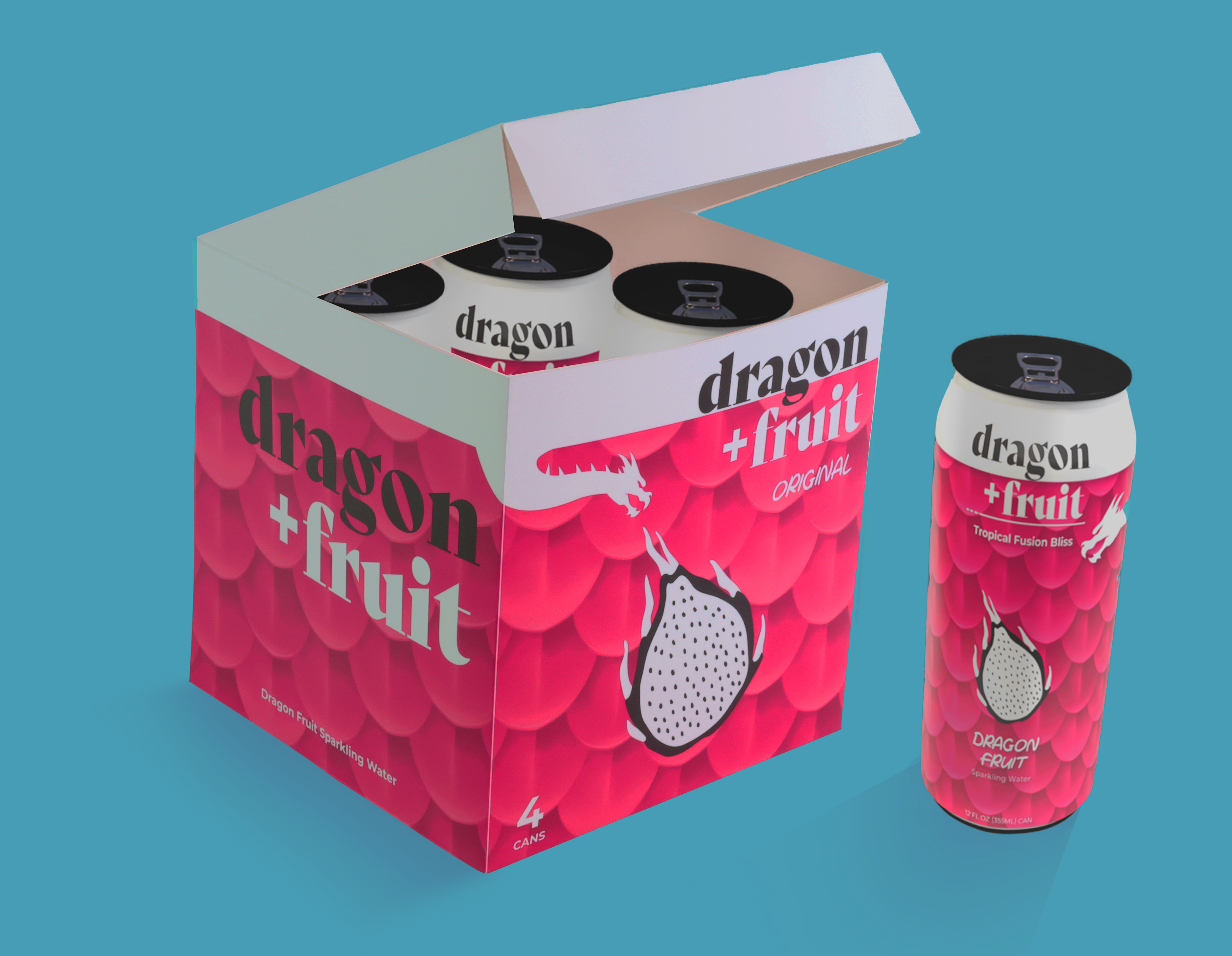
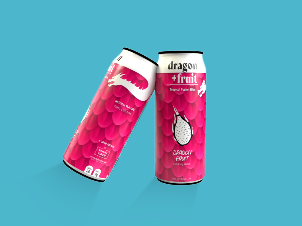
This product and packaging design project was inspired by the vibrant look and unique texture of dragon fruit. I wanted to create a bold and visually striking brand concept that embodied the fruit's tropical, exotic appeal while maintaining a minimal and modern aesthetic. The idea was to translate the scales and patterns of a dragon into a recognizable design language that could seamlessly extend across packaging and branding elements.
Creative Process
I began with brainstorming and sketching ideas, exploring how the dragon fruit’s natural patterns and colors could inspire the packaging design. My goal was to strike a balance between playful and premium, incorporating bright, eye-catching colors while keeping the brand elements clean and minimal. The final design features sleek packaging with bold typography and a consistent imagery style that reflects the tropical fusion flavors.
I began with brainstorming and sketching ideas, exploring how the dragon fruit’s natural patterns and colors could inspire the packaging design. My goal was to strike a balance between playful and premium, incorporating bright, eye-catching colors while keeping the brand elements clean and minimal. The final design features sleek packaging with bold typography and a consistent imagery style that reflects the tropical fusion flavors.
Brainstorming Designs
Final Design
The completed project includes a cohesive lineup of product visuals, from cans to multipack boxes, all designed to create an engaging brand identity that stands out on shelves. This project allowed me to combine my passion for bold aesthetics with functional product design.
Click the phone screen below to view flavors.
